|
|
|||
page 15 of 23 |
|
|
|||
page 15 of 23 |
| Stained Glass from Your Inkjet: Part II,
Digital Filters by Jim McGee In last month's digital column I talked about creating faux stained glass panels using your ink jet printer (preferably a wide carriage ink jet) and transparencies. Straight prints are OK as a starting point, but stained glass usually doesn't have the detail of a straight print. Simple images with defined edges, broad details, and rich color work best for this kind of display. In keeping with that idea I used Adobe PhotoShop LE to create several variations on a straightforward image to illustrate the kinds of things you can do. What makes this a fun project is there is no right and wrong, no correct color balance, and no worries about sharpness or accuracy. This is all about experimentation. And while I used PhotoShop LE, virtually every image editing program uses PhotoShop Plug-in compatible filters. So no matter what program you're using the filters will work the same way, and you can actually swap filters between programs (see you software's manual or HELP menus to find out how).
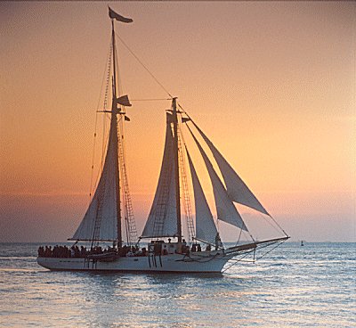
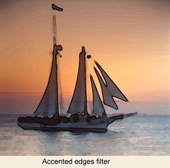
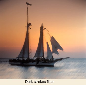
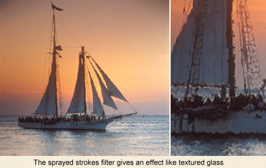
For my image I chose this sunset image of the Schooner Western Union. It has well defined edges to make it stand out from the background and the sunset sky has bold colors. For this column I decided to use a well thought out, methodical, scientific approach. In other words I opened the image and proceeded to screw around for a couple of hours trying different filters and different settings unitl I figured out what I liked. One thing to make sure of is that you save your original image under a different name. Liking things simple, my original was named WesternUnion.tiff, and the copy was called WesternUnion2.tiff. All the changes were made to WesternUnion2.tiff so that I always had an original I could go back to. As I tried each filter I would save a copy of the file with the name of the filter. For example if I like the effect of the dark strokes filter I would save a copy of the image as DarkStrokes.tif. This way when I was done I could print or open files and compare the images side by side. After a couple of hours of playing it's impossible to remember which filters you liked. This way you don't have to worry about remembering. To start I tried some more extreme effects shown below:
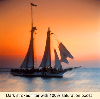
I liked the dark strokes filter but I thought it was a bit bland so I boosted the color saturation by a full 100% which made a dramatic difference in the image. Remember you're going for a bold look here not trying to replicate the colors in the original slide.
Next I tried the sprayed strokes filter. It's tough to see the effect of the filter at this resolution so I included a detail shot as well. This filter gives the image a feel of textured glass and would be a good choice for a stained glass panel.
The palette knife filter gives you a look that, at first glance, seems similar to the sprayed strokes filter. But when you look a little closer it has much more of a painterly feel to it.
The key here is to experiment with different filters for different looks. When you apply a filter to an image a dialog box like the one shown here will pop up.
Keep in mind that the preview window can be zoomed in and out, and in some cases you'll have to zoom in pretty tight to see the effect of the controls. A couple of things to remember if you're going for stained glass. If the photos and paintings in the room are all of a single theme than your stained glass panels should echo that theme. The other is to be aware of the colors in your stained glass panels. They'll be backlit for part of the day and will project colored light into the room. The panels can be mounted in wooden frames attached to your windows or into simple mat board attached with double sided tape. Just remember that over time they will begin to fade so you have to have some provision for replacing the panels. As for the test print that I did back in January it still looks good and isn't showing any noticeable fading or color shift. I would expect that the permanence of any ink jet transparency will vary widely depending on whose transparency you're using and the intensity of the sunlight it's exposed to. So have some fun and experiment a little. Too often we get so serious about our images and forget this is all supposed to be fun!
|
|
|
text and photography copyright © 2001 Vivid Light Publishing |

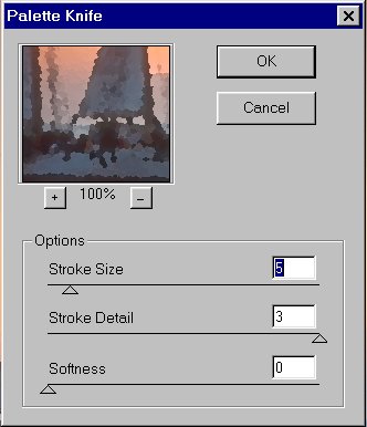 It will
display a preview window and give you several options you can
vary. The names of these options may or may not seem to make any
sense. The best approach is to start out by setting each in turn
to it's minimum and maximum settings. By going to extremes you'll
be able to see the effect of that control immediately.
It will
display a preview window and give you several options you can
vary. The names of these options may or may not seem to make any
sense. The best approach is to start out by setting each in turn
to it's minimum and maximum settings. By going to extremes you'll
be able to see the effect of that control immediately.

