|
|
|
|
|
|
| Creating Fine Art Prints at
Home Part 1 of 2 by Jim McGee At one time getting serious about photography meant building a home darkroom. There was no other way to take full control of the creative process. Doing a "straight print", an unadulterated print straight from the negative, was a sign that you didn't know your way around a darkroom. The emergence of color signaled the demise of the home darkroom. The color printing process was simply beyond the average enthusiast in both cost and complexity. With the disappearance of the home darkroom came the attitude that you had to get it right every time "in camera" because you had no way to control the process once the film was exposed. Requesting custom printing - where you worked with the lab to dodge and burn the final image - was too costly for all but pros and the folks who worked at magazines. The emergence of Photoshop and photo quality color printers gave photographers back the ability to again control their images through the whole creative process from pressing the shutter to the creation of the final print. But a funny thing happened along the way. The idea of getting right every time "in camera" had become so entrenched that it was assumed that you were indulging in some kind of unethical behavior if you used these new digital tools to create an image that looked better than the original negative or slide. Hogwash! Back to the Future Seeing prints from those original untouched negatives projected on screen I realized just how much work had been done. Not only did Adams have no expectation of being satisfied with a straight print, he deliberately chose to expose his negatives so they would provide him the most detail to work with in the dark room rather than choosing a "correct" exposure for a straight print he would never make. The process we're going to follow here is very different from the chemical process that Ansel Adams followed and that John Sexton still follows, yet in many ways it is still the same process. It will take some practice but when you see the results you'll be amazed. Background For the purposes of this article I'll assume the following:
By the way, you won't have to go through every one of these steps with every image. In many cases you'll be able to get a stunning print directly from a negative or slide. But understanding what you can do will open up possibilities. Your Starting Point Start with a good baseline. Tweak your scanner to get a scan that matches as closely as possible the image on your slide. If you're working from a negative scan for the best compromise between highlight and shadow as you would if you were creating a straight print. Next create two variations on your baseline scan; one biased toward bringing out the detail in the shadows and one biased toward the highlights. These scans will, and should, look bad. In one the highlights will be completely blown out and in the other the shadow areas will lose all detail and block up. These extremes give you the detail you'll need to dodge and burn your final image. To get an acceptable scan for the shadows you may find that you'll have also have to significantly reduce contrast. At this stage that's OK. Some scanners support multi-sample scanning that will give better shadow detail with less noise. This is the time to use it. You'll notice that as you scan for the shadows that those shadow areas will sometimes show a pronounced blue cast - especially if there is snow in those areas. Don't correct it! Shadows should have a bluish cast. It it is too pronounced you may need to do a little color correction later. But for now leave the blue in. These biased scans will bring out detail that you wouldn't normally be able to get from just making adjustments to your baseline image. If you're working from a raw digital file, use the raw mode software that came with your camera to accomplish the same thing - files biased towards shadow and highlight detail. Though your scanner and your raw file software both will likely give you an option to sharpen the image now is not the time to do it. RESIST THE TEMPTATION. If you are cropping the image you MUST make sure that all three versions are cropped exactly the same. The process will vary depending on your software or scanner.
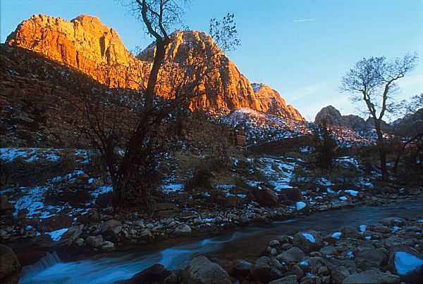
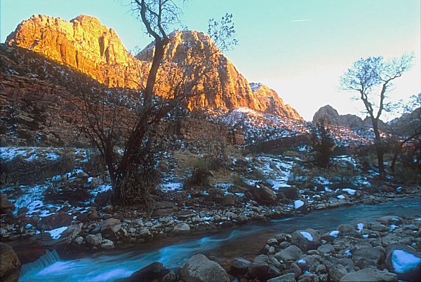
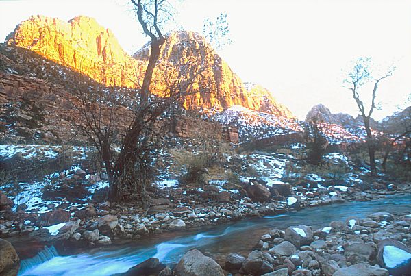
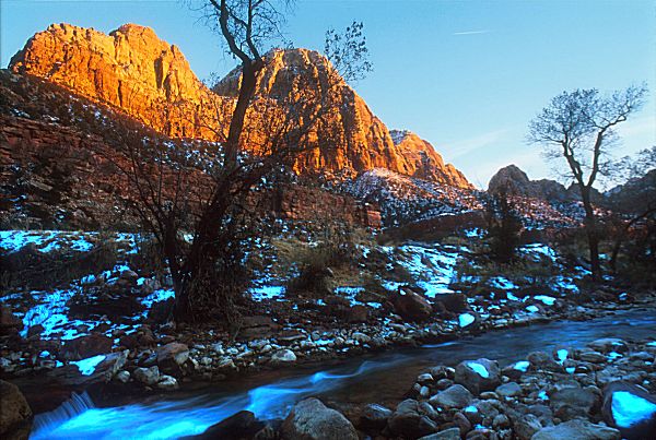
Housekeeping This way if you don't like a result it is easy to step backwards to a previous version. This is better than the undo buffer in your software. You'll be working with large areas of a large file and in some cases doing many small operations. In many programs you'll find that you won't be able to undo your way back out of something if you don't like the results. So save often and after each stage move on to another version of the file. Image Cleanup At this stage do a test print of each of the images onto cheap photo paper. You don't need your highest resolution, as these are just test prints. I like to use Canon HR-101 paper. It's ceramic coating holds 720dpi printing well and shows good detail. The tones will likely be a bit different from your final photo paper but that doesn't matter at this point. You can also use something like Great White Presentation Paper for this step. Any inexpensive paper capable of holding detail and a decent resolution will do. Starting with your "straight scan" look for imperfections that need to be corrected. Check your horizon. Is it straight? If not you'll need to rotate each of your scans by the same amount until it is. Are there unwanted elements in the image? Unwanted elements could be a road sign sticking up in an otherwise perfect desert landscape, telephone poles and wires, cars, people, or even an odd tree that doesn't fit in with an otherwise perfect tree line. In this image the problem is the contrail in the upper right corner. Make notes about what you want to correct right on the print. This may feel like sacrilege the first time your do it but you'll soon see the advantage of having your notes right on the print. Next move on to the print showing your shadow details. Lay it down next to your straight print. Are there details you want to bring out of the shadows? Is there detail there at all or is it mud? If a shadow area is too muddy I prefer to let the shadows go to black as this often looks "correct" to the eye. But ultimately it depends on your individual image and what you're after. Remember there is no right and wrong. You're making the creative decisions. Finally look at the image showing your highlight details. The first thing you want to look for is if there are any highlight details. If the highlights are blown out there's nothing you're going to do to get them back. Assuming that there is detail in the highlights compare your highlight print to your straight print. Are these highlights that you want to bring out in your final image? If so indicate which areas you want to bring out by writing them right on the print. It's perfectly OK for some highlights to be pure white. Work carefully. I usually start in a corner and work around each print towards looking at details but there is no right or wrong way to do this. Pay special attention to the center of interest in the image. Since that is where your eye is naturally drawn mistakes and imperfections around the center of interest will be the most noticeable. In this case the viewers eye tends to follow the line of the stream and finally rest on the brightly lit peak - so look carefully along these sight lines as well. Roll Up Your Sleeves, Lets Shuffle Some Layers Starting with my middle print I identified areas that I wanted to bring out. I carefully cut those areas out one at a time and pasted each into my baseline image as a new layer. I'll merge those areas that are the same exposure value so that I can make adjustments to all of those areas as a group. In my example image I pulled shadow detail from the middle image and created a layer that just had shadow detail. I then copied this layer and carefully pasted it into my working image. As I bring these areas in I'll do some rough tweaking but I don't worry yet about getting them perfect. The trick is to make sure that they're perfectly aligned. Most programs that support layers will allow you to adjust the transparency of the layer. I like to set the donor layer to 70% transparency so that I can easily see through to the image underneath. Once it is exactly aligned I turn the transparency back down to zero so none of the underlying image shows through. Next I choose the dodge tool for combining the layers and bring it in to roughly the value I'm after. Finally I follow the same procedure for areas that are burned out and bring in elements from my "highlights" file. You'll find that the highlights are tougher to bring in. Burned out highlights in your baseline print may have a halo around them of pixels that are burned out badly. It will take some experimentation to blend in your donor areas. Really pesky areas may take two applications of the same area: one that includes the halo area, and one that doesn't, set to different transparencies. The effect is to overlay one to dull down the halo effect (not worrying about adding highlight detail to the burned out area) and the final layer fills in the highlights. Don't be discouraged. This takes practice.
Making them all Play Together Time to Pay Attention to Color and Tone Final Touch-ups After everything is touched up it's time to start selectively sharpening and blurring the image. Seemingly everyone is familiar with the sharpening tool. It's the most overused tool in digital imaging. But here you're going to be selective in your sharpening. If you've already merged your layers mask off the areas you want to sharpen. Never sharpen your skies. This will introduce grainy distortion that will take away from the final image. You can sharpen clouds however. Just stay well inside the areas where the cloud transitions into the sky. Sharpening threatening thunderheads in particular can add drama and depth to an image. Be conscious of the transition areas between your subject and the sky. Over sharpening and poor masking will combine to create a halo effect wherever the sky touches your subject or the landscape. Sharpening may bring out specs of dust or scratches in the original film that weren't all that noticeable before. Take your time at a high magnification and go around your image to ensure that you've cleaned up any of these areas. The ability to blur areas of an image is just as important as the ability to sharpen the overall image. Our focus is on sharpness because that is how lenses are sold and "tack sharp" is generally viewed as a compliment to the photographer. But the image should only be tack sharp in the plane of focus. Distracting background elements are rendered soft at wide apertures but there may still be enough detail there to be distracting. Masking off those background areas and a judicious blurring with the Gaussian Blur tool will increase the apparent sharpness of the foreground subject and help it to jump out at the viewer. This is also a good way to clean up grain in images shot with older or high speed films. Film grain will be most noticeable in soft out of focus areas and in continuous tone areas such as skies. Gaussian blur can be applied to these areas to make the grain soften and disappear. The result is that the whole image will look as though it was shot with a slower, more fine grained film. The Print Once the print has fully dried carefully look at it in indirect sunlight - not under incandescent or fluorescent lighting. Look at the colors and tones first then look at the details of the print. Do this from a reasonable viewing distance. Things that you can only see with your nose pressed to the paper don't matter because no one looks at a print that way. If you're happy with the result break out the picture frame! If not you've got at least one more cycle of correct and reprint ahead of you. Manage Your Expectations
Don't Forget to have Fun
|
|
|
|
|
|
|
|
|
|
|