|
|
|
|
|
|
|
Curves and Levels - Part II In Curves and Levels Part I, we went into the basics of what curves and levels could do for you and how much more control over tonal and color adjustments you had when compared to a tool like brightness/contrast. I wanted to keep it simple in order to let you get your feet wet. Some of you said, "Come on Gary, we can handle it, give us a little more substance." All right, you win. I still believe you can get the job done without all the techno-information that some books provide. If you need to know that a 24 bit image has 16.7 million colors, because it has 3 channels of 8 bits each and 256 to the power of 3 is 16.7 million then you're reading the wrong article. However, if you want to learn how to get from picture to print and you don't consider yourself an Einstein, then you have come to the right place. I mentioned last time the importance of having a good image to start with. The scan and how you work the image after the scan make the biggest difference in how the final print looks. In this article that still holds true. The sample photo used to illustrate this article was selected for several reasons. First, it is a beautiful image, but like so many others that I've seen, the detail is there in the slide, but it can be a challenge to print. Second, that cold western sky made it easy to over-polarize, but I wanted the rich color of the late afternoon sun to stand out as it lit the mountain. Without the polarizer, it may have looked a little flat, and I needed detail in the clouds. Third, I knew that part of the scene would be in shadow. This shot was made on Fuji Velvia, and while Velvia is great for color saturation, it can be contrasty. So now that I've set the stage for this particular image. Let's see what we can do to improve it using Curves and Levels.
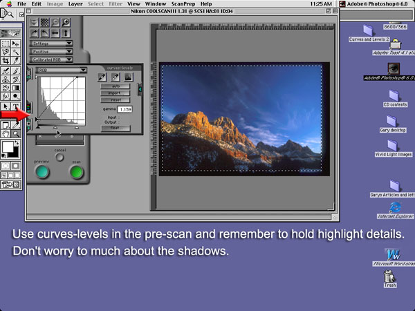
In the first illustration I again want to stress the importance of a good scan. Take your time using the Curves/Levels selection to get the image looking good in the pre-scan. The pre-scan is showing you there are more dark areas than light ones (or shadows than highlights). Take the white triangle on the right and bring toward the left to where the graph begins to read the image. The middle triangle can be used to increase the brightness in your mid-tones. Because of the heavy weighting of this image toward the "dark side, Luke", no adjustment is made to the triangle on the left. I moved up the triangle on the far left where the red arrow is pointing to adjust the overall brightness of the image. Then I felt that I was ready to perform the actual scan. It takes less time to do it than to read it.
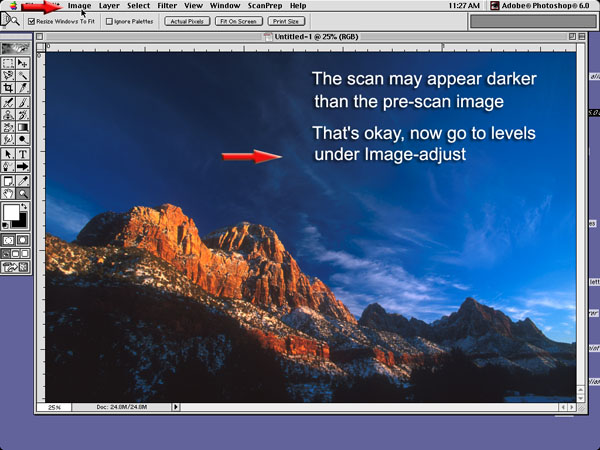
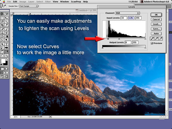
The first thing you may notice is that the image appears to be a little darker than the pre-scan. That's okay. Follow the red arrows and open Image along the menu bar, then Adjust, and open Levels.
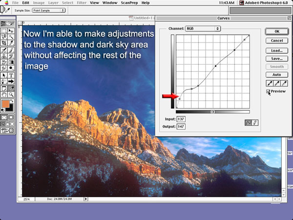
You can now make adjustments to the image, much the same way you did in the pre-scan. Great, but what about the shadows and the overpowering blue sky? Well, it's time to use Curves. Again go to the menu bar (I'm getting hungry) and select Image, Adjust, and this time, Curves.
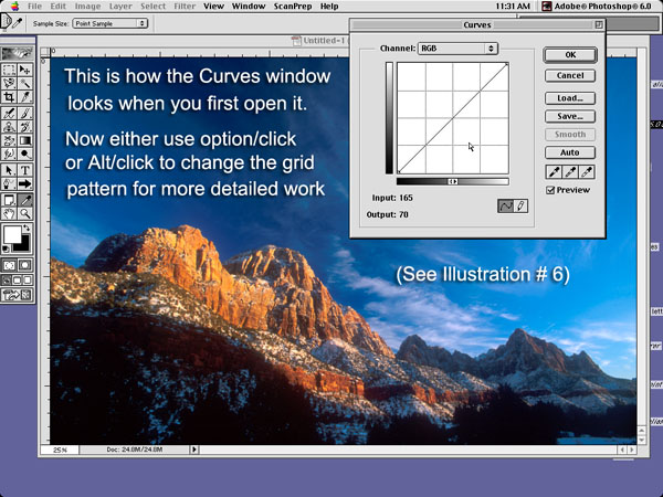
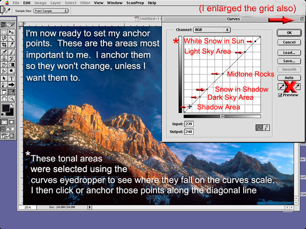
I found this to be the most important part to understanding just how powerful a tool like Curves really is. Carefully look again at the bottom image. When you have made your grid settings and enlarged the grid-viewing box (top image), drag your cursor or 'eyedropper' over the surface of your image. Now, click your mouse button to take a tonal reading at some point on the image. Two things happen simultaneously. One: A small circle appears at a point along the diagonal line to indicate where, on that scale, the tonality of that selection falls. Secondly: An input-output box appears with a numerical reading to show where that tonality falls. You now can either visually click at the point where you saw the circle, or, once you entered an anchor point on the diagonal line, hold down your mouse button and slide the anchor up or down until it matches the numbers that you read in the input-output box. When you move an anchor point left or right, you affect contrast, and the Input number. When you move an anchor point up or down, you affect brightness, and the Output number. You can repeat the process until you have a sufficient number of anchor points (up to 14 including the end points). How do I choose these points? Well, I simply select important parts of the image that I know I want to remain unchanged as I make changes to other parts. The bottom image shows those that I have selected. Keep in mind that I use Photoshop 6.0 and there could be some variances with your particular software. For example, I can precisely adjust those anchor points in any direction using my arrow keys on my keyboard. You may have to use your mouse. Also, you can make similar changes to specific colors using the curves selection, by going up to RGB and selecting a color channel. Then select anchor points and make adjustments in a similar manner to what I am describing here.
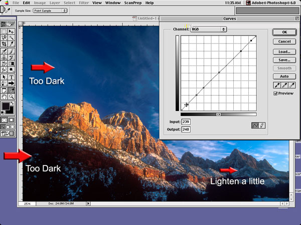
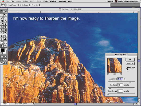
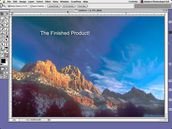
The top image shows those areas that I wish to correct. I am not interested in eliminating them, just correcting them so that they match more closely to my original slide. Yes, if I want a printed image that I think will look better than my original slide, I will adjust it accordingly. Now compare the top and bottom images. The subtle adjustments I have made make all the difference in how the final image looks. Finally I sharpen the image using Unsharp Mask, and there you have the finished product. Now all I have to do is save it and or resize it for printing.
Understanding Curves and Levels should be much clearer now, but keep in mind it takes practice and a trained eye to get the consistency you desire. That takes time. Trust me, I know. Click Here to read Curves & Levels - Part I |
|
|
|
|
|
|
|
|
|