Digital Infrared
by Jim McGee
 Infrared film has seen resurgence in popularity recently.
The images it produces have a unique dreamy quality that just can't be
duplicated digitally. Infrared film has seen resurgence in popularity recently.
The images it produces have a unique dreamy quality that just can't be
duplicated digitally.
Or can they?
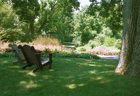
Landscapes with a lot of foliage work best as subjects for infrared.
The same is true for this digital technique.
Frankly you'll be amazed at how easy this one is. I used Jasc's Paint Shop Pro
7.0 to illustrate this article but the technique should work equally well
using Photoshop, Photoshop Elements or any photo editing software that
supports mixing color channels.
Getting Started
First find a photo that contains a lot of foliage that you think might
look interesting if shot with infrared film.
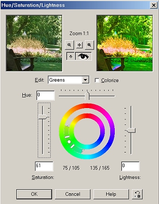
| Crank up the saturation for the green color channel.
To do this open the dialog box for adjusting hue and saturation.
Choose Greens from the edit menu and crank the saturation up. Don't
worry if it looks like an alien landscape at this point - that's
what you want. |
 |
Take a close look at the resulting image. Look for areas that are blown
out or nearly blown out. Tone down those areas by burning them in or
adjusting the gamma level for that area or even for the whole image.

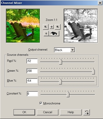
| Now open the Channel Mixer dialog. Check the
monochrome box. Turn up the green channel to it's
max value and turn the red and blue channels down to around minus 50% as a
starting point. |
 |
With Preview turned on adjust the red and blue channels
downward while watching the effect on the image. Use them to tweak the
final effect. You'll be surprised. Small adjustments can have a dramatic
effect on the image. So save a couple of versions along the way so that you can look
at the results side by side. You can also go back and experiment with
adjustments to the green saturation level to see the effect that they have
on the final image.
|
|
|
Initially the
image was just completely blown out and unusable. |
|
|
|
Some slight
tweaking produced this image. Unfortunately a lot of detail is lost
to the scaling. A print of the image looked better but still wasn't
what I was after. |
|

|
|
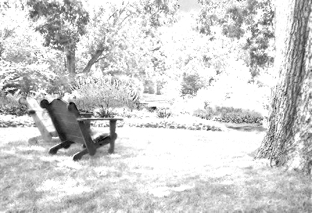
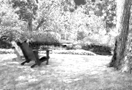
I went back to
the original image and used a value of 30 for the saturation
adjustment instead of the initial value of 61 and liked the results
much better. The print retained more detail with fewer highlights
blown out. Remember this process will lighten the green values. So
you increase saturation of the green channel to lighten the print
and increase the effect and decrease saturation to decrease the
infrared effect and darken the image.
There's no hard
and fast rules here. Experiment until you get an image you like.
Remember to save intermediate versions so you can step back if you
don't like the direction you're going and do small test prints along
the way. With this kind of process a test print is much more
valuable than staring at a computer screen. |
The Final Step
Print that sucker! You can do this as a straight black and white print or
you can tone the print as we explained last month. It's that simple and
it's a fun technique to experiment with. The key is to experiment. Small
changes to settings can yield big changes in the final image.
It's also fun to play with different subjects. Try landscapes, statues,
old buildings, even grave monuments!
A Variation
You can control the infrared effect by the amount of green present in a
part of the image. Want to increase the effect on a portion of the image
to get a unique effect? Watch how the different channels in the color
mixer are affecting the area you want to tweak.
Make a copy of the original image and promote that area to it's own
level. Now tweak the colors for that level by increasing the red, blue, or
green tones. Merge the layers, adjust the saturation, open the channel
mixer and look at the results. By playing with the color balance in the
original image you can selectively control the infrared effect.
 Subscribe to
Vivid Light
Subscribe to
Vivid Light
Photography by email
Tell
Us What You Think
|