Creating Fine Art Prints at
Home:
Black & White Printing
by Jim McGee
 All
of the techniques covered in last months column about selective scanning,
dodging, burning, and blending all apply equally to creating black and
white prints - if anything it's even more critical to master these
techniques for black & white printing. It's stating the obvious that
you're working with a more limited palette in black and white. That means
that you're using tone, shadow, and contrast to convey your message. You
can't depend on color to grab and hold the viewer. All
of the techniques covered in last months column about selective scanning,
dodging, burning, and blending all apply equally to creating black and
white prints - if anything it's even more critical to master these
techniques for black & white printing. It's stating the obvious that
you're working with a more limited palette in black and white. That means
that you're using tone, shadow, and contrast to convey your message. You
can't depend on color to grab and hold the viewer.
Color Casts, Neutral Prints, and Expectations
Anyone who's ever worked in a darkroom will tell you that it can be
difficult to get a neutral print. Every paper-chemical combination has
it's own characteristics. Photographers who spend a lot of time in the
darkroom develop an affinity for certain papers that borders on religious.
Some develop their own chemical cocktails to use in the printing process.
These folks sound more like alchemists than photographers after a while!
So it should come as no surprise that various printer, ink, and paper
combinations yield results that can vary greatly - but yet it does. Most
photographers today have never set foot in a darkroom or have only dabbled
there. No matter how cynical we might be we've all fallen for the illusion
that all you have to do is hit the print button and wonderful things will
come out of your printer. Hogwash!
Once you get serious about your digital printing you'll go through
various levels of fighting with your system to ensure that what comes out
of the printer looks like what is on your screen. Depending on your
personality this can range from setting it up by "eyeballing it"
to buying and using any one of the color calibration tools that are
available. But even these are not foolproof. Talk to a lab that does high
quality printing from digital files and they'll usually tell you to use a
specific calibration tool or to send along a reference print from your own
photo printer. The reason is simple. Those high-tech calibration tools
seldom agree with each other. The only way the lab can ensure that you're
working from the same standard is if you're using the same tools.
 It gets even worse with black and white. Despite anything that a
manufacturer may say to the contrary color printers are designed to print
color images and they don't do a great job with black and white out of the
box. It gets even worse with black and white. Despite anything that a
manufacturer may say to the contrary color printers are designed to print
color images and they don't do a great job with black and white out of the
box.
As
a starting point do a black and white print on your printer using the
default settings and the manufacturers paper (Epson paper for an Epson
printer). The image should be converted using the desaturate tool rather
than the grayscale tool. The technical folks out there just raised their
hands to tell me that either method will yield an 8-bit image with 256
shades of gray. The difference is that some printer drivers will default
to printing with black only if you use grayscale. Grayscale also limits
your ability to tone the image later on.
The printer should be in color, not black and white, mode. This
resulting print will have a definite colorcast. Depending on the
manufacturer and model it will probably be noticeably magenta, yellow, or
greenish.
Why keep the printer in color mode instead of switching it to black and
white mode? Because many photo printers will produce very grainy results
in black and white mode, with noticeable dithering (dots) in continuous
tone areas.
Eyeballing out the Color Cast
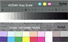 Stop at your favorite photo supply house and pick up a Kodak Grayscale
wedge or color separation guide. This is a tool used in the darkroom that can be handy for
calibrating the output of your printer. Or you can create a grayscale wedge in
Photoshop (or whatever image editor you're using) as detailed in the
sidebar. Stop at your favorite photo supply house and pick up a Kodak Grayscale
wedge or color separation guide. This is a tool used in the darkroom that can be handy for
calibrating the output of your printer. Or you can create a grayscale wedge in
Photoshop (or whatever image editor you're using) as detailed in the
sidebar.
Print the wedge using the default settings on your printer, photo paper
(matte or glossy) and your printer set to photo mode. You will likely see
a couple of problems. First there will be a colorcast. It may appear
across the spectrum or it may only occur in the midtones - again depending
on the model of printer you're using. The other problem you're likely to
see is a lack of separation between adjacent tones, particularly in your
darkest tones. If you can't see the separation you're loosing shadow
detail. Next compare the wedge you printed against the Kodak Grayscale
wedge. Is the wedge from your printer shifting darker or lighter than the
Kodak wedge?
To fix these problems we'll need to go into the printer's driver
software and make some adjustments. We'll save those adjustments under a
descriptive name such as "black & white settings" so that it
will be easy to switch between printing color and black & white
images. The specific steps here are for Epson printers but they will be
similar for HP and Canon printers.
To get to the settings for the driver choose Print from the File menu.
Chose the correct paper type and then click on Custom which will display
an Advanced button. Pick it.
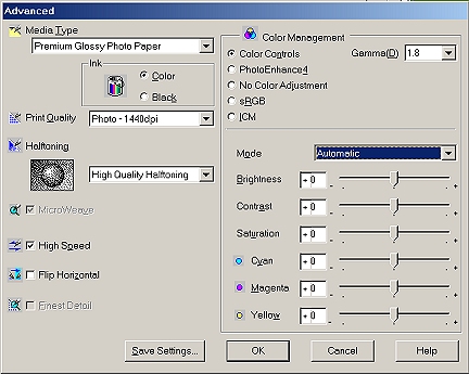
You should now see the screen pictured here or something very similar.
First make sure that you choose high quality half toning, that micro-weave
is turned on, and that high speed printing is turned off. Together these
settings will significantly reduce any banding (light & dark bands) in
your print and they will make continuous tone areas appear smoother. Under
color controls you'll have the option of fine tuning the output of the
printer.
Gamma - Controls image contrast by modifying the midtones and
midlevel grays.
Mode - On Epson printers either Automatic or Photo-realistic.
Automatic provides output that closely matches the original image.
Photo-realistic increases the contrast of the output. Your best bet if
there are contrast problems is to choose Automatic and manually adjust
the contrast.
Individual Controls - Allow you to adjust brightness, contrast,
saturation, and color to match your original. Use the color controls to
eliminate color casts and brightness, contrast, and saturation to match
the output to your screen.
Fine-tune your output so that the results closely match the grayscale
wedge and any color cast is removed. The resulting print should also
match your monitor as closely as possible. This assumes that you've dialed
in your monitor using the tools available in Windows or the Mac OS. The
process is straightforward for Mac users. But all the variations of
Windows and tools provided with various video cards make this an
infinitely variable process for PC users. Check the documentation for your
individual machine or check under Display Properties by clicking on
settings, choosing advanced, and then exploring the options that are
available for
your particular machine. You can reach Display Properties by right click
on the Windows Desktop.
Effects Using Color Channels
So now you can get a print that looks like your screen. How about getting
better results with the image on your screen. Photoshop 7 does a much
better job with grayscale images than previous versions. Color channels
allow you to adjust your black and white images for effects similar to
what you would get if you were using filters with black & white film.
It's much easier to learn about this through experimentation than through
reading. So grab an image and choose Image,
Adjust, Channel Mixer. Click
on Monochrome. Now adjust the red, green, and blue channels and watch the
results on your image. You can use the Constant setting at the bottom of
the control box as a kind of a crude exposure setting.
RGB vs. Lab Color Space
You've probably noticed that a straight conversion to grayscale, no matter
what method you use, gives you an image that is less than stellar. As a
matter of fact it probably looks a bit muddy and drab. The result is a far
cry from your visions of fine art black and white prints and generally
these images lack punch. Why is this?
 RGB and CMYK color spaces combine color and brightness information. LAB
color space on the other hand separates color and brightness information -
making it a better choice for some black and white work. As an experiment
convert your image from RGB to LAB mode. Next click on the Channels
palette and delete the A and B channels. Your image will now look brighter
and your midtones will have more punch. Convert the image back to
grayscale for printing or RGB for toning and you'll be surprised at the
difference. RGB and CMYK color spaces combine color and brightness information. LAB
color space on the other hand separates color and brightness information -
making it a better choice for some black and white work. As an experiment
convert your image from RGB to LAB mode. Next click on the Channels
palette and delete the A and B channels. Your image will now look brighter
and your midtones will have more punch. Convert the image back to
grayscale for printing or RGB for toning and you'll be surprised at the
difference.
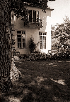
Toning
Using the Print Driver
The most common example of toning that we've all seen is sepia toning.
This gives your images a warmer "old timey" look that many
people find attractive. Most printers allow you to choose sepia toning
right in the print driver. This option will take either a color or black
and white image and print it as a sepia toned image. The result isn't bad
but you have little or no control of how the tone will be applied.
In the next installment we'll talk about dedicated black and white
printers, high quality ink and paper combinations that provide amazing
results, duotones, and tritones.
Other references
A great reference for the art of black and white printing is the
three book set on photography by Ansel Adams that includes The
Camera, The Negative, and The Print. Though much of what is written
there has to do with chemicals in the darkroom there is a lot of good
information for the digital printer for two reasons. First there are
definite parallels between darkroom and digital darkroom processes.
These books very graphically show you what is possible as well as the
why certain decisions are made in the printing process. Second many of
the tools in Photoshop are named for the darkroom processes that they
emulate. Believe it or not, reading these books may help you to better
understand Photoshop!
The Digital Print Handbook: A photographer's guide to creative
printing techniques by Tim Daly. An excellent book that gets into
the nuts and bolts of digital printing. Master all the techniques that
Daly describes in this book and you will indeed be a master printer.
Photoshop 7 Savvy by Steve Romaniello. A great guide to the
nuts and bolts of Photoshop and a good supplement to the manual.
Photoshop 7 User Guide from Adobe. The manual that ships with
Photoshop is pretty good but a lot of people ignore it in favor of books
because they assume that any software manual will be lousy. This one is
worth a look.
Creating a Grayscale Wedge
Open a new document. Run the gradient tool straight across the page.
Go to Posterize and enter 21 as the number of steps. This will
create a grayscale wedge that you can use to setup your printer for
printing black and white images. |
 Subscribe to
Vivid Light
Subscribe to
Vivid Light
Photography by email
Tell
Us What You Think
|