|
|
|||
|
page 16 of 23 |
|||
|
|
|||
|
page 16 of 23 |
|||
| A Digital Enhancing Filter by Jim McGee
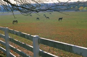
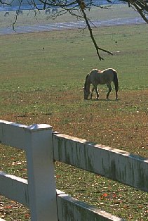
You're driving down a back road on a beautiful fall day and you spot a lovely scene. Horses graze in a pasture, a barn off in the misty distance, and perfect white fences to add order and foreground interest to the scene. You pull over and grab your camera out of the back seat and walk up to the fence. One of the horses even obliges by making eye contact with you as you take the shot. But as so often happens, when the slide comes back from the processor all is not well. The scene is as you remember it in the viewfinder but the harsh late morning sun has left the image looking a little flat. While it's sharp from the foreground until it fades into the misty distance it's just lacking that something to really make it sing. You confine the slide to your "almost pile" and sigh, wishing you had had an enhancing filter along that morning. That, you think, would have made all the difference in this image. That's exactly what happened to me when I took the pastoral photo you see here. For those of you not familiar with them, an Enhancing filter is a unique color correction filter available from Tiffen. Unlike many filters, which leave an image looking as though it has been obviously filtered, an enhancing filter saturates reds, rust browns, and oranges while leaving the other colors in the spectrum unaffected. This means that whites stay white and greens stay green. While it is best known for adding punch to fall scenes it can be used for any number of applications including red barns in winter and scenes with a lot of earth tones. The only side effect to using an enhancing filter is that at some angles the sky can pick up a slightly magenta cast - though this is noticeable only if you're looking for it. That's all well and good but it doesn't much help my horse shot as I didn't have an enhancing filter with me that morning. I was going through my "almost" pile recently when I rediscovered the image in question. I could remember the morning I took the shot clearly and wished again for that filter. Then I realized that there was a way I could accomplish the same thing in Paint Shop Pro. After scanning the image to PhotoCD I loaded it into Paint Shop Pro. Standard operating procedure for scanned images calls for running a sharpening filter and slightly boosting saturation to get back to the image on the original slide. In less then a minute this was done and I had the original you see at the top of the page (you can click on any of the images to see more detail).
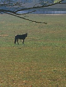
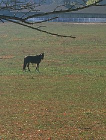
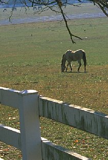
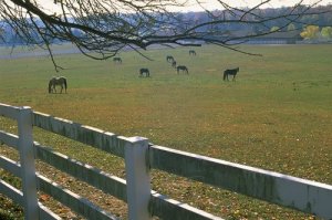
The concept behind the Hue Map is that you've taken the color wheel and laid it out flat. The degree marks along the top of the map represent the location of each hue on the color wheel. You can now take any of those hues, represented by ten sliders, and move them towards any other hue in the spectrum. The degree marks along the bottom of the map indicate the "new position" of that hue on the color wheel. I've got to admit that the first time I read about the hue map in the manual it didn't quite click. I had to play around with it a little to really understand the effect it does, and more importantly does not, have on an image. In this case I wanted to saturate only the earth tones while leaving the rest of the image untouched. Since I wanted more saturation in those washed out earth tones I decided to experiment with bringing my oranges and yellows closer to red on the color wheel. After some initial experimentation I settled on only tweaking orange. Orange is located at 36° on the color wheel. Red is at 0°. I moved Orange toward red by 12° bringing it to 24°. This looked pretty good on the screen but a test print of part of the image showed it to be too orange and unnatural looking. Some additional tweaking of orange back up to 28° gave me a more natural result. An initial test print looked good so I fired off an 8x10 for my office. I'm pleased with the result and happy that I kept this image in the "almost" pile instead of throwing it into the trash pile, and it's turned out to be one of my "most requested" prints. I've placed the images side by side here to
compare the differences. The warm tones are immediately obvious
in the image on the right. Not as obvious due to the size of the
image on the web is the warm tones added to the treeline and the
barn in the background. In these close ups you can see the difference in earth tones. This more closely matches what was actually before the lens that morning
Notice that the white fence in the foreground and the colors in the mare's coat are unchanged.
|
It's just lacking that something to really make it sing
I wanted to saturate only the earth tones while leaving the rest of the image untouched
|
|
text and photography copyright © 2001 Vivid Light Publishing |
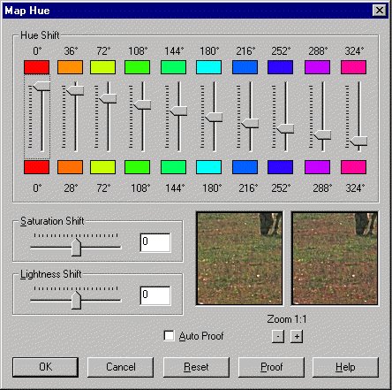 Next I opened the
Hue Map (under the Colors menu). The Hue Map allows you to
individually tailor any one hue within the color spectrum without
altering any of the other colors. That means that, like Tiffen's
Enhancing Filter, my whites would remain white and my sky would
remain blue.
Next I opened the
Hue Map (under the Colors menu). The Hue Map allows you to
individually tailor any one hue within the color spectrum without
altering any of the other colors. That means that, like Tiffen's
Enhancing Filter, my whites would remain white and my sky would
remain blue.